Logo Design · Pharmaceuticals · 2022
Haxin Laboratories Pvt Ltd: Logo Design Case Study
From a boxed H to a blue wordmark with an X — a rebrand built around trust and dependability for a pharmaceutical company.
The brand
Haxin Laboratories is a pharmaceutical company in Odisha, incorporated in December 2021. It began with a logo made by a freelance graphic designer. As part of its launch campaign, the logo needed updating so it could communicate the company's core principles — dependability and trust — more clearly.
How we approached it
The brief was a logo that put trust and dependability first and sat comfortably alongside established pharmaceutical brands, together with a brand manual and mockups so the new identity could be explained clearly to stakeholders.
The client, Mr Swadeep Mohanty of Haxin Laboratories, contributed ideas that shaped the concept and the wireframe for the identity. Blue became the primary colour because it is widely associated with reliability, professionalism and trust.
The identity
From a boxed H to a wordmark with an X
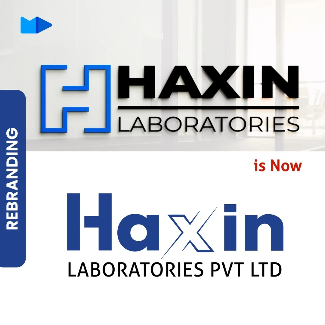
The original logo paired a blue, square-framed H icon with "HAXIN" in black capitals and a thin "LABORATORIES" line beneath. The new logo drops the icon and lets the name carry the mark: "Haxin" in blue, with the H built from heavy bars and the x drawn as a lighter, outlined letter, above "LABORATORIES PVT LTD" in black capitals.
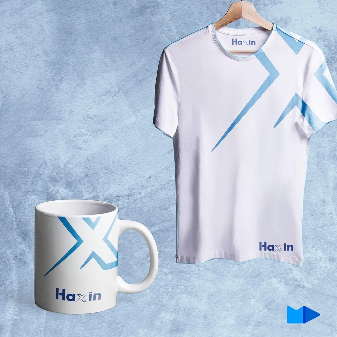
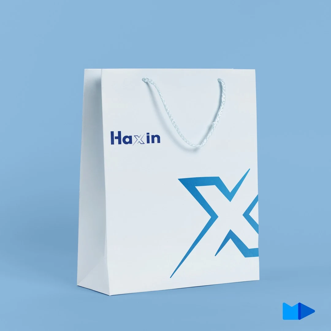
The x does more than sit in the wordmark. Lifted out as a large, light-blue shape, it becomes the identity's supporting graphic, running across apparel, merchandise and stationery. Makos Digital announced the rebrand on its Instagram page on 1 February 2022.
What the identity consists of
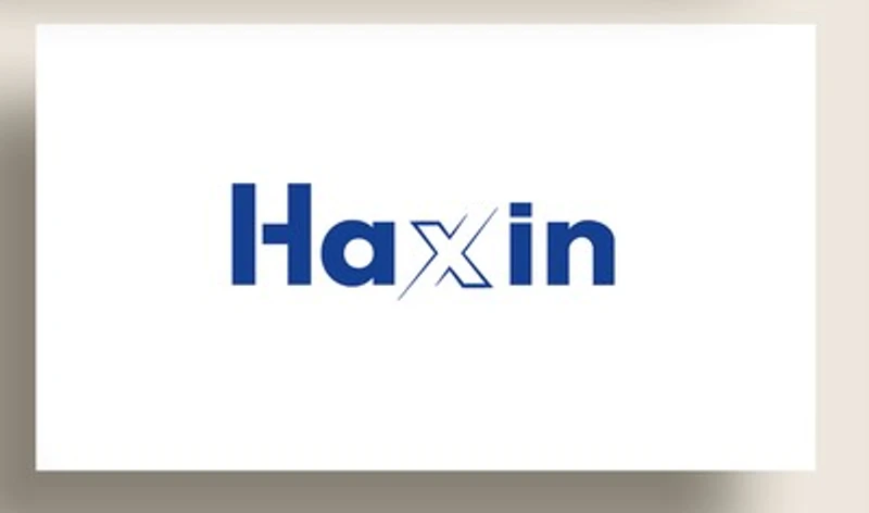
- Wordmark: "Haxin" in blue, with the x drawn as a lighter outlined letter, above "LABORATORIES PVT LTD" in black capitals
- Colour: blue as the primary colour, chosen for its associations with reliability, professionalism and trust
- Supporting graphic: the x lifted out of the wordmark as a large light-blue shape, used on apparel, merchandise and stationery
- Brand manual: guidance on how to use the logo, typography, colour scheme and overall visual identity
Applications
The identity in use
The new identity was shown applied across apparel and a mug, a shopping bag and business stationery. These are mockups of how the wordmark and the x graphic carry across everyday items, not production runs.
FAQ
Makos Digital designed the new logo and brand identity, replacing a logo made earlier by a freelance graphic designer.
The boxed H icon and black capitals were replaced by a blue "Haxin" wordmark with a stylised outlined x, and the x became a supporting graphic used across apparel, merchandise and stationery.
Blue is widely associated with reliability, professionalism and trust — the qualities the rebrand set out to communicate for a pharmaceutical company.
Yes. A brand manual covering logo usage, typography, colour scheme and overall visual identity accompanied the new logo, along with mockups showing it in use.
Yes. Logo and brand identity design is part of our Branding & Creative Design service — contact us with a short description of your business and we'll tell you how a logo project would run.
Need a logo or brand identity?
Tell us about your business and we'll show you how a logo project would run — real concepts, not templates.