Logo Design · Logistics & Disposal Services · 2026
VA Logistics & Disposal Services: Logo Design Case Study
Eight logo concepts across three directions — and the gold-and-silver identity the client finalised.
8
Concepts
3
Directions
1
Finalised identity
The brand
VA Logistics & Disposal Services is a Singapore-based logistics and transport company — one of the international clients Makos Digital works with remotely from Chennai.
The name carries two ideas: moving things (logistics) and dealing with what's left over responsibly (disposal). The logo had to hold both in a two-letter monogram — "VA" — that works on its own as an icon and sits comfortably next to a full name and service line.
How we approached it
Rather than polish a single idea, we explored the monogram in three different directions, each drawn as finished artwork — complete logo lockups with a tagline — instead of rough sketches. That made the differences between them easy to judge side by side.
The concepts below are shown in the order they were developed. The tagline changed with the idea: each direction told a slightly different story about what the business does.
Concept directions
Three ways to draw the same monogram
Direction 1 — Movement
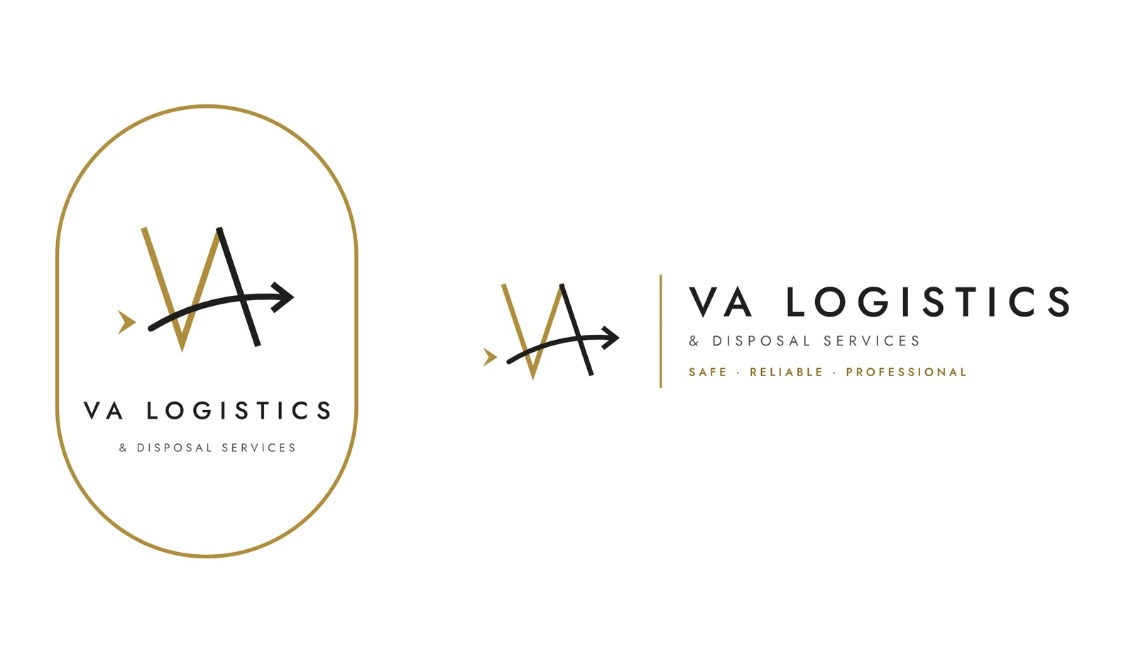
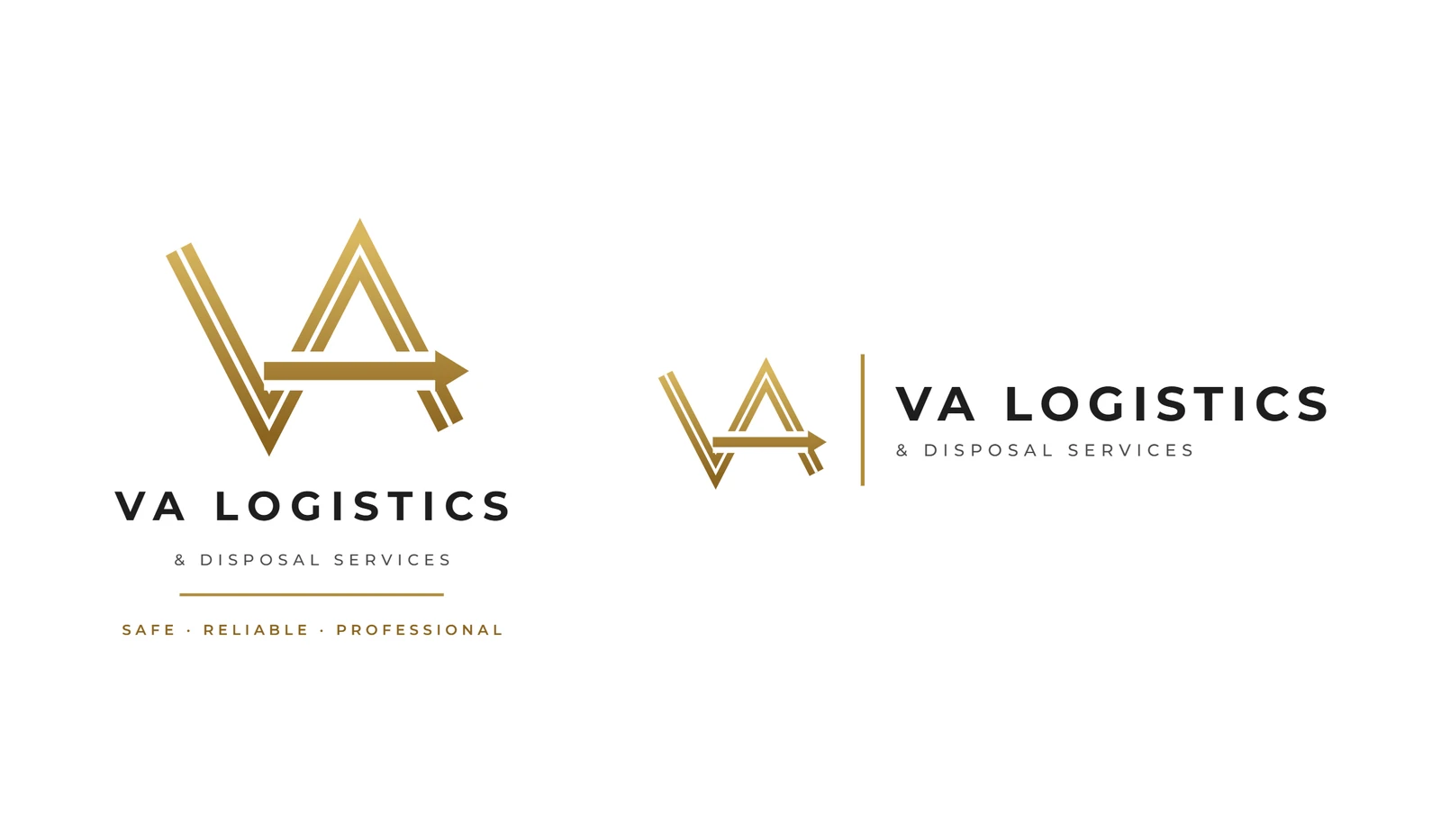
The first idea leaned into the logistics half of the name: forward motion, drawn as an arrow running through the VA monogram. One version threads the arrow through a thin gold V and a black A inside an oval frame; the other redraws the monogram as a gold outline with the arrow cutting across both letters.
Direction 2 — Recycling
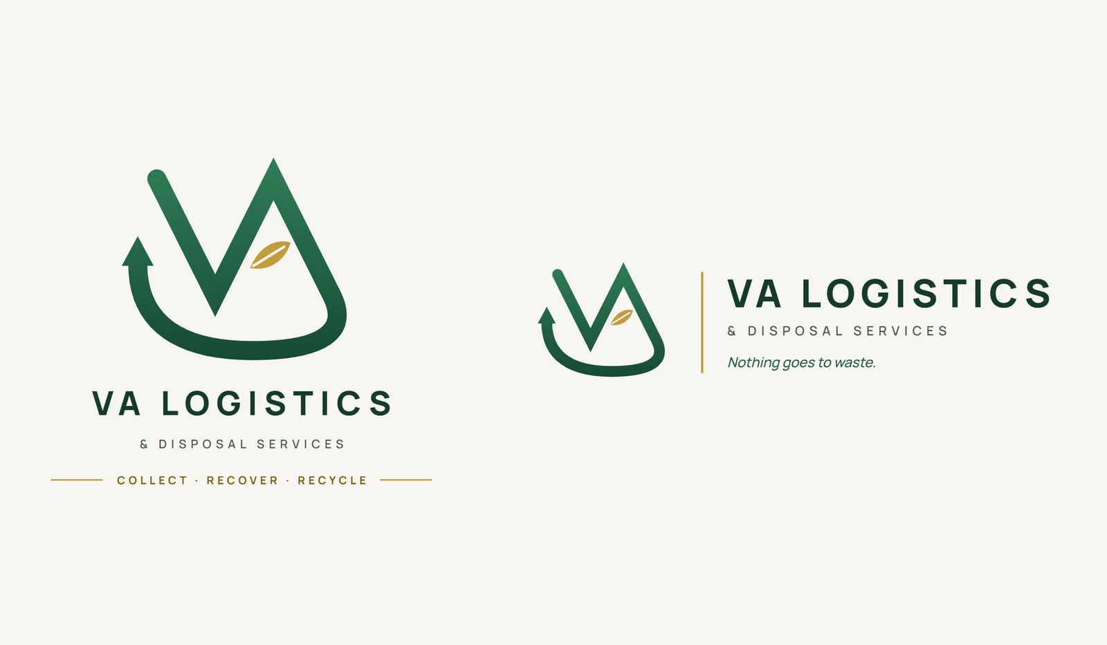
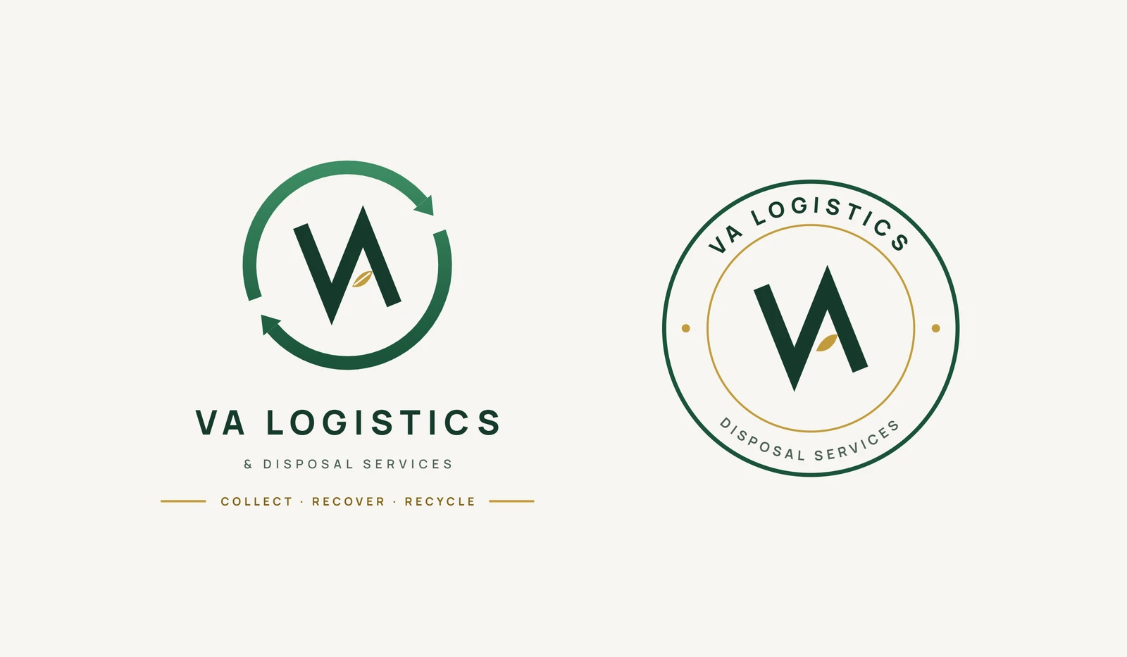
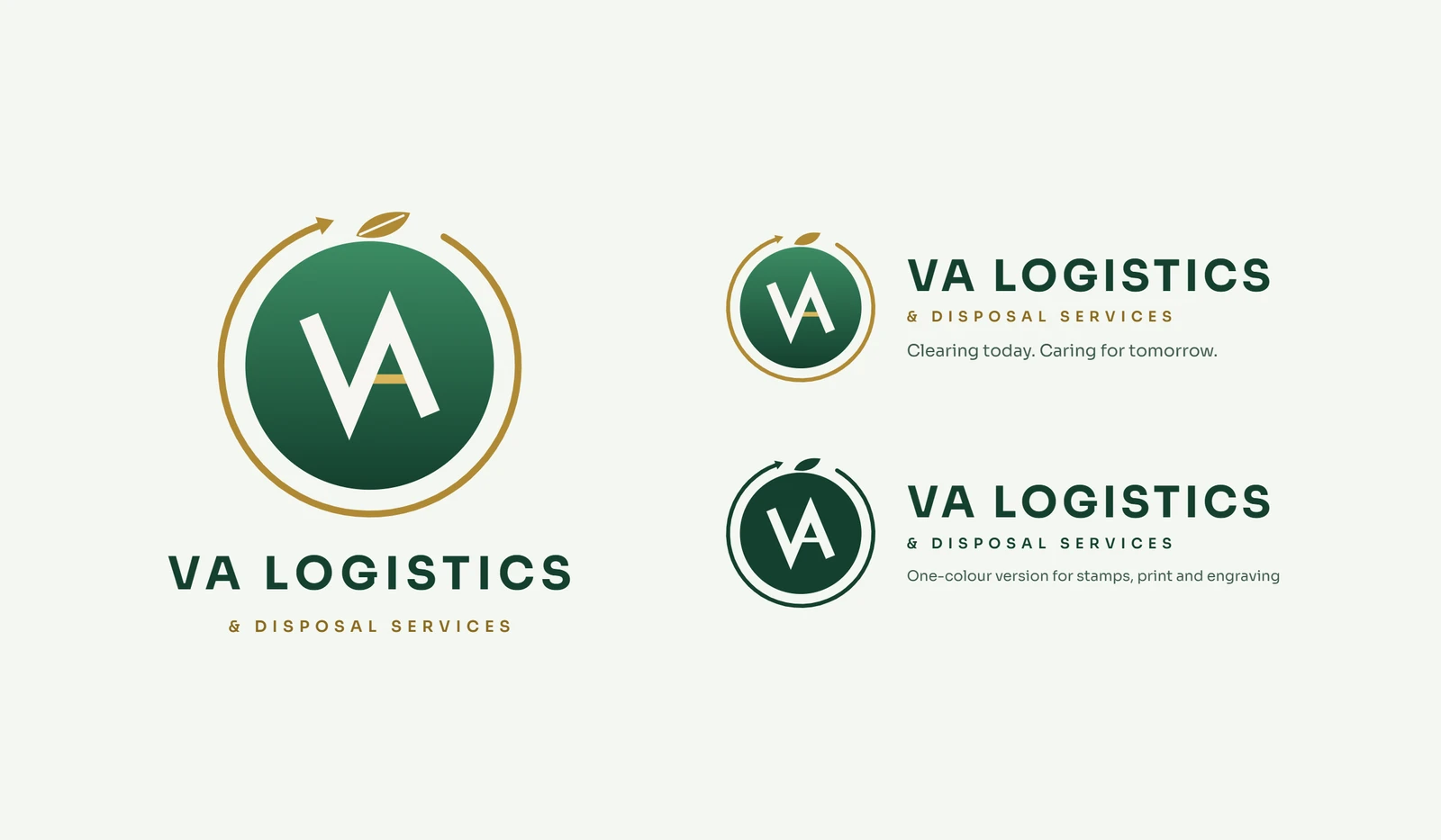
The second direction turned toward the disposal half of the name: green, with a leaf and a recycling motion built in. One concept draws the V and A as a single continuous stroke that loops underneath and returns as an upward arrow. Another wraps the monogram in a pair of recycling arrows and adds a circular seal as a secondary mark. A third sets a white monogram in a green sphere, ringed by a gold arrow with a leaf on top — and includes a one-colour version for stamps, print and engraving.
Direction 3 — Silver and gold
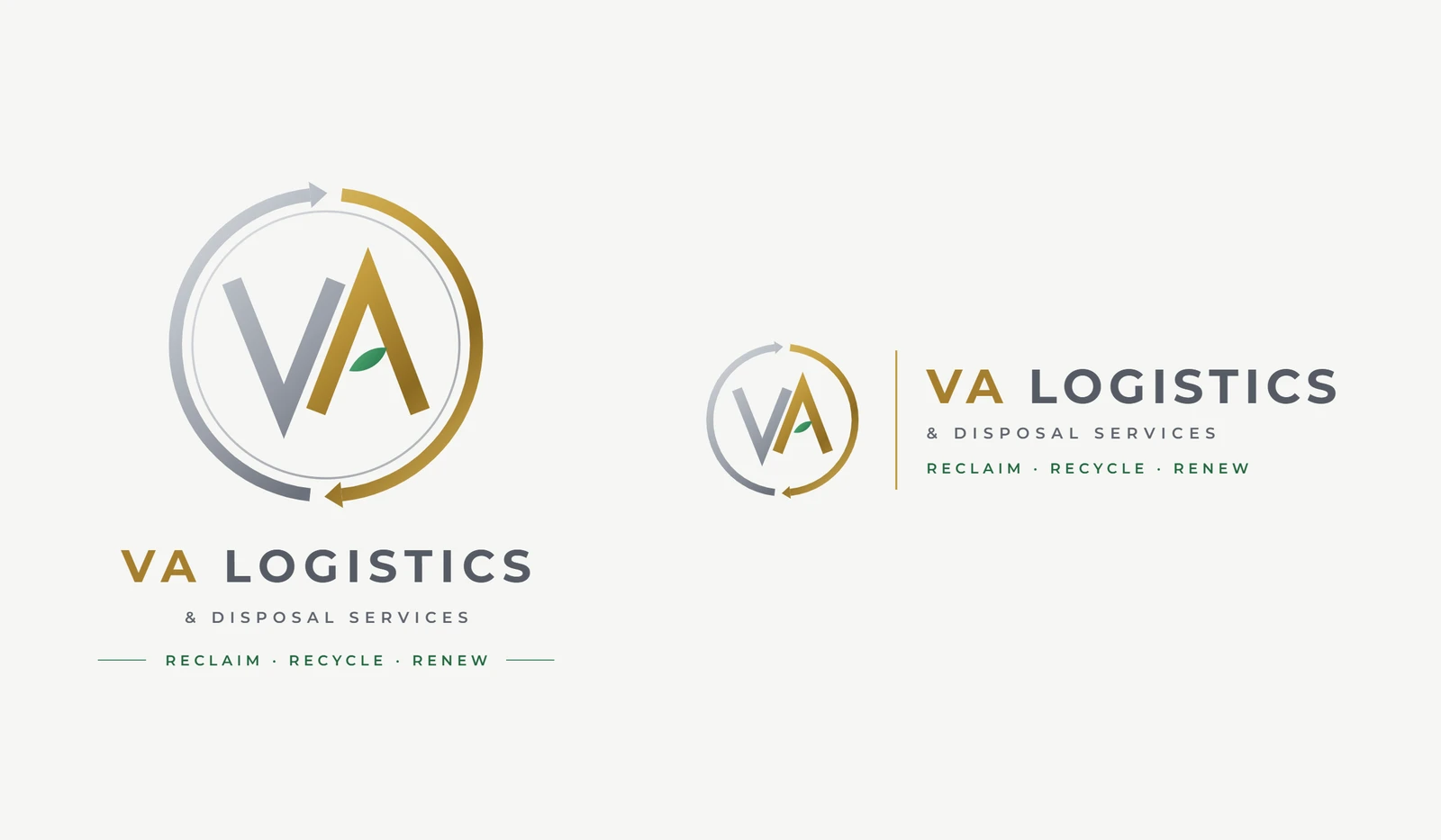
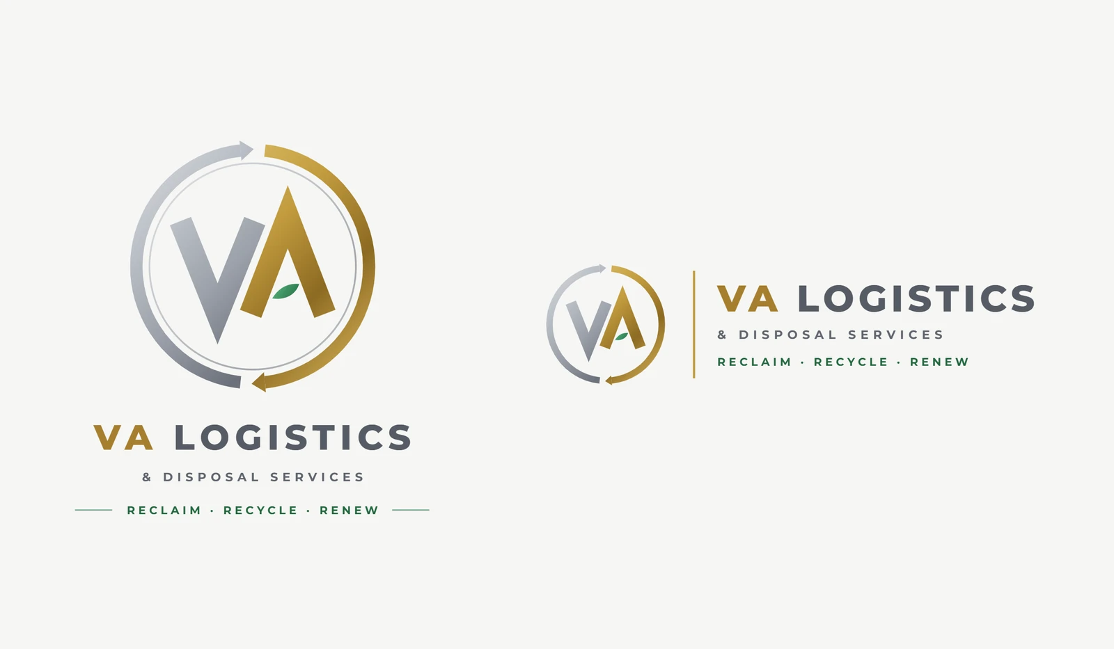
The third direction kept the recycling loop but moved to a premium metallic palette: silver and gold gradient arrows circling the VA monogram, with a small green leaf nested in the A. Concept C and Concept D refined the letterforms and proportions of the monogram — D thickened the strokes.
Client finalised
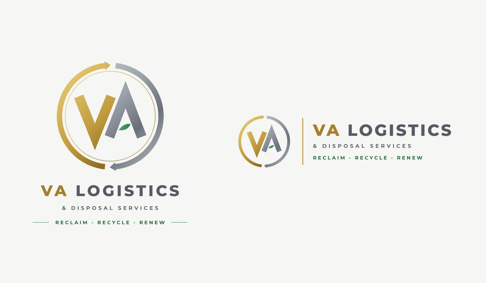
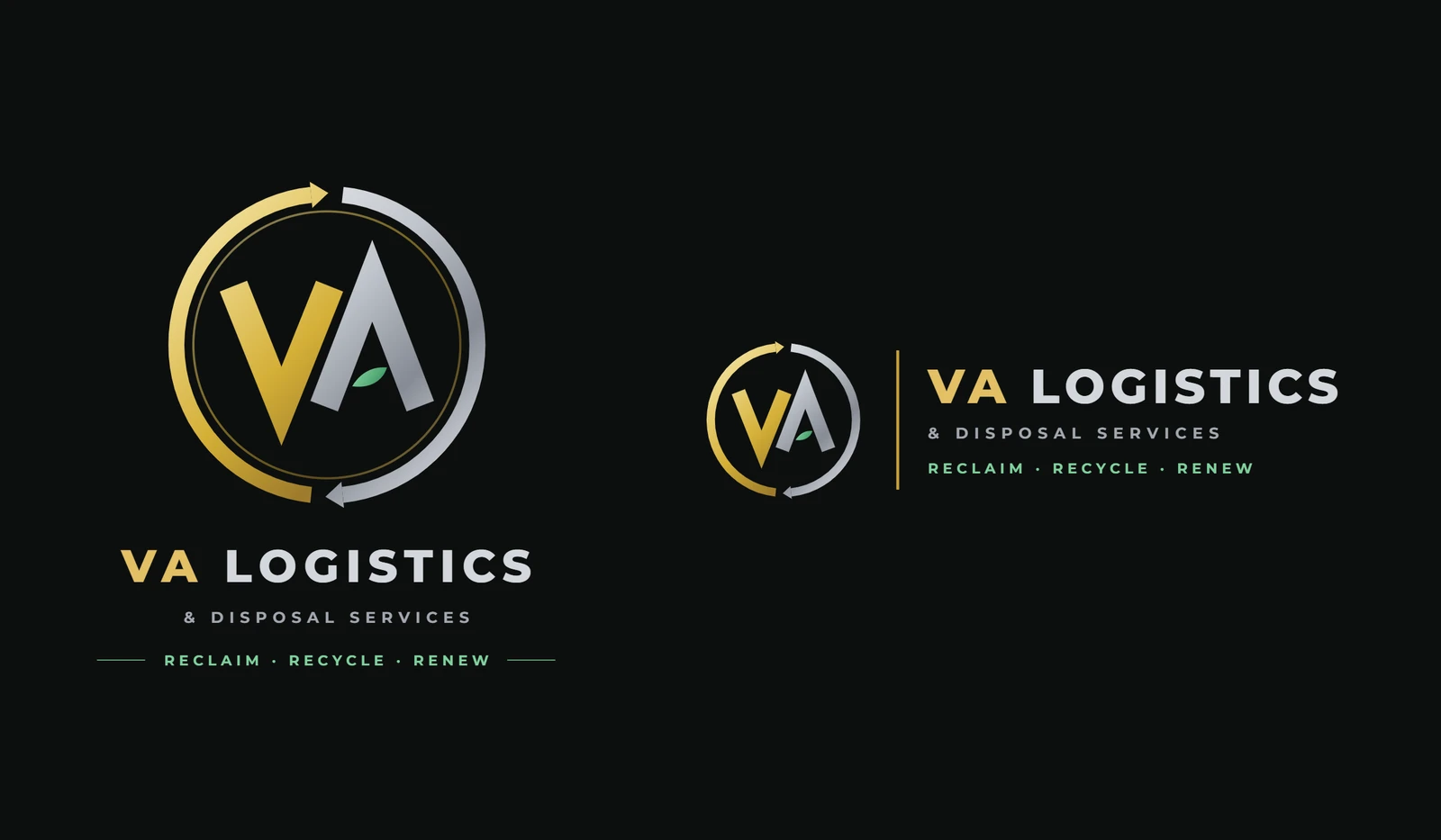
The finalised identity: Concept E
The client finalised Concept E. It keeps Concept D's heavier letterforms and swaps the metals: the V is now gold and the A silver, with a gold arrow sweeping up the left side and over the top and a silver one coming down the right and back underneath, so the pair reads as one continuous loop.
The wordmark follows the monogram's palette — "VA" in gold, "LOGISTICS" in slate — with "& Disposal Services" and the tagline Reclaim · Recycle · Renew set small, in wide-tracked capitals underneath.
What the identity consists of
- Monogram: a gold V and a silver A inside a pair of looping arrows, one gold and one silver
- Leaf: a small green leaf set inside the A — the one organic detail in an otherwise metallic mark
- Wordmark: "VA" in gold, "LOGISTICS" in slate, with "& Disposal Services" and the tagline in wide-tracked capitals
- Lockups: a stacked version and a horizontal version, each drawn for both light and dark backgrounds
Applications
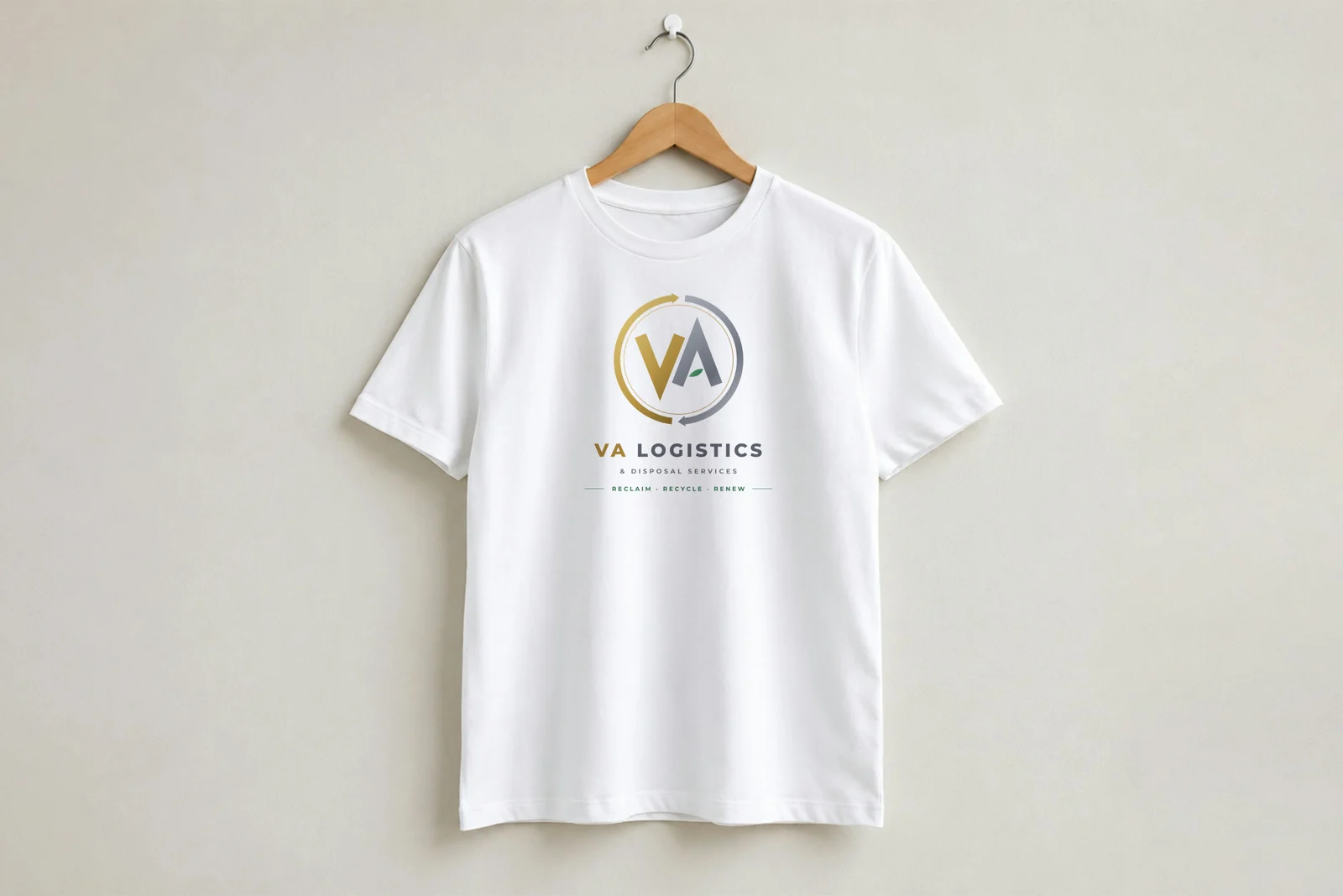
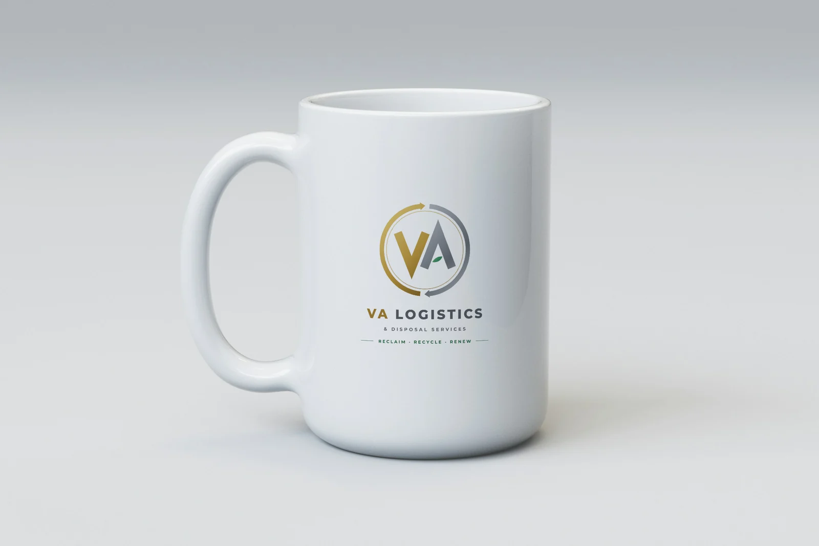
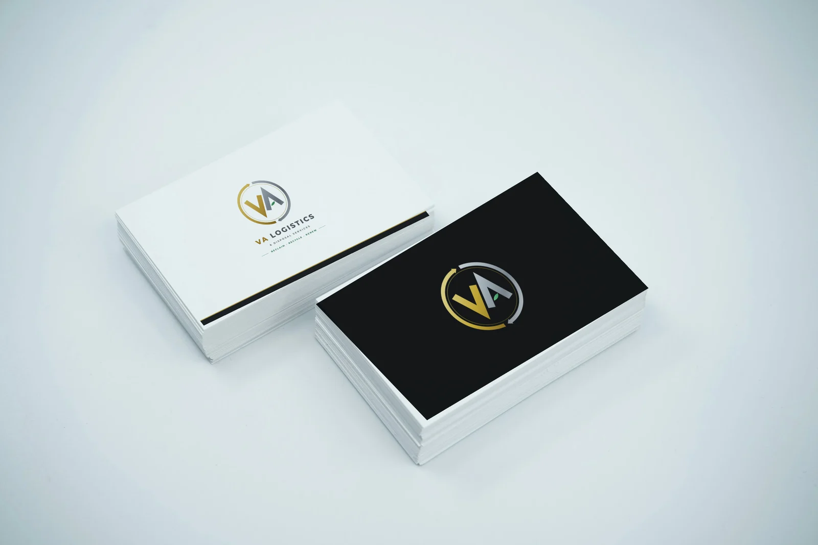
The identity in use
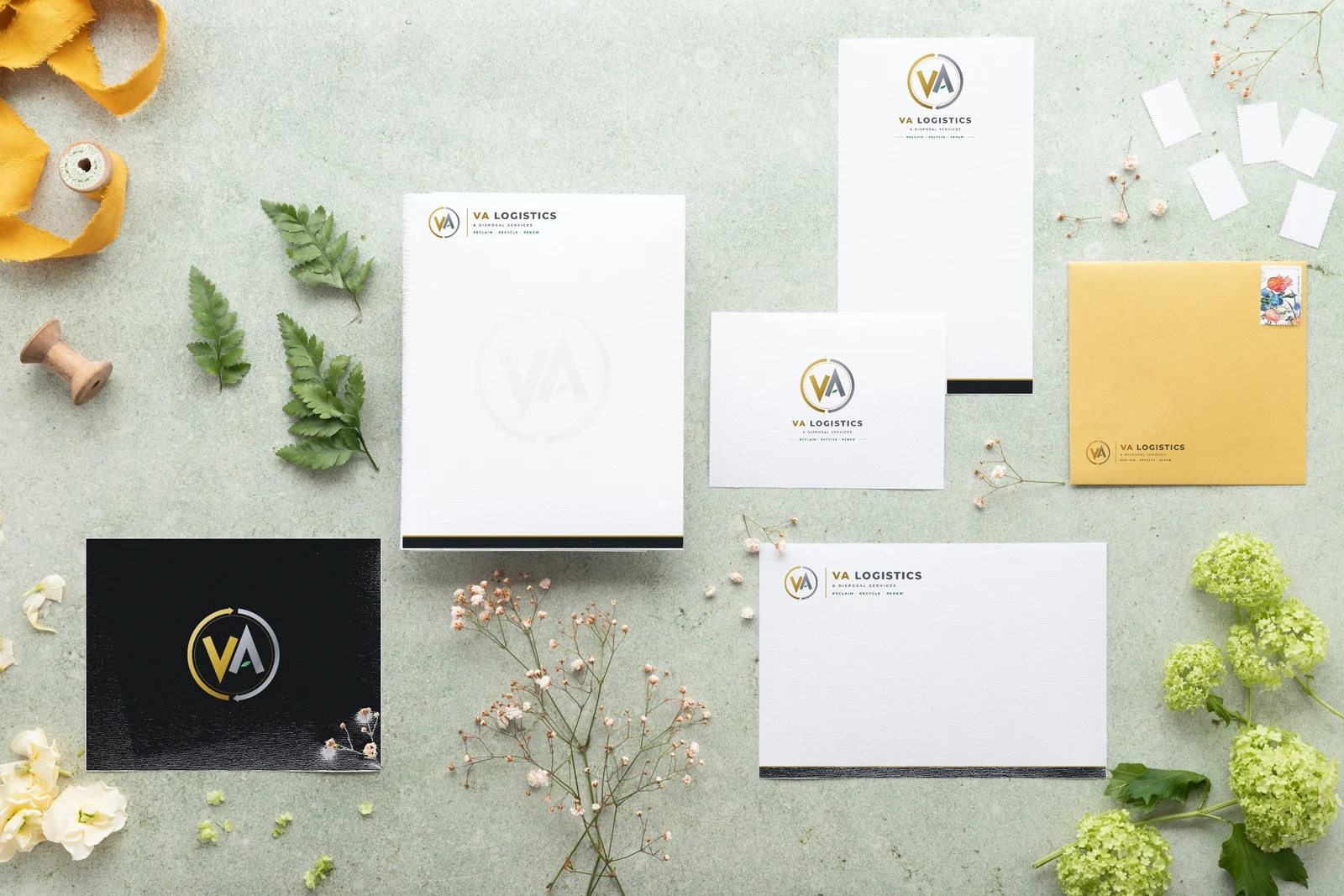
The final mark on a T-shirt, a coffee mug, business cards and a stationery set. These are mockups — the logo placed onto photographs of blank products — not photographs of finished production runs.
FAQ
Makos Digital designed it. This page shows the concepts developed and the identity the client finalised.
This case study shows eight concepts across three directions: two built around an arrow, three around a green recycling theme, and three in silver and gold.
Concept E, from the silver-and-gold direction — a gold V and silver A inside a loop of two arrows, with a green leaf in the A.
Yes. With the logo complete, Makos Digital is building the VA Logistics website on the same identity, with launch scheduled for 26 October 2026.
Yes. VA Logistics is based in Singapore, and we work with clients in India, Singapore, Australia and the UAE. Our only office is in Perungudi, Chennai — work for clients outside the city is delivered remotely.
Yes. Logo and brand identity design is part of our Branding & Creative Design service — contact us with a short description of your business and we'll tell you how a logo project would run.
Need a logo or brand identity?
Tell us about your business and we'll show you how a logo project would run — real concepts, not templates.