Logo Design · Rebrand · 2026
Zeal & Dream: Logo Design Case Study
An ornate phoenix redrawn as a flat, powerful one — with a refined wordmark and a palette that holds up on every background.
The brand
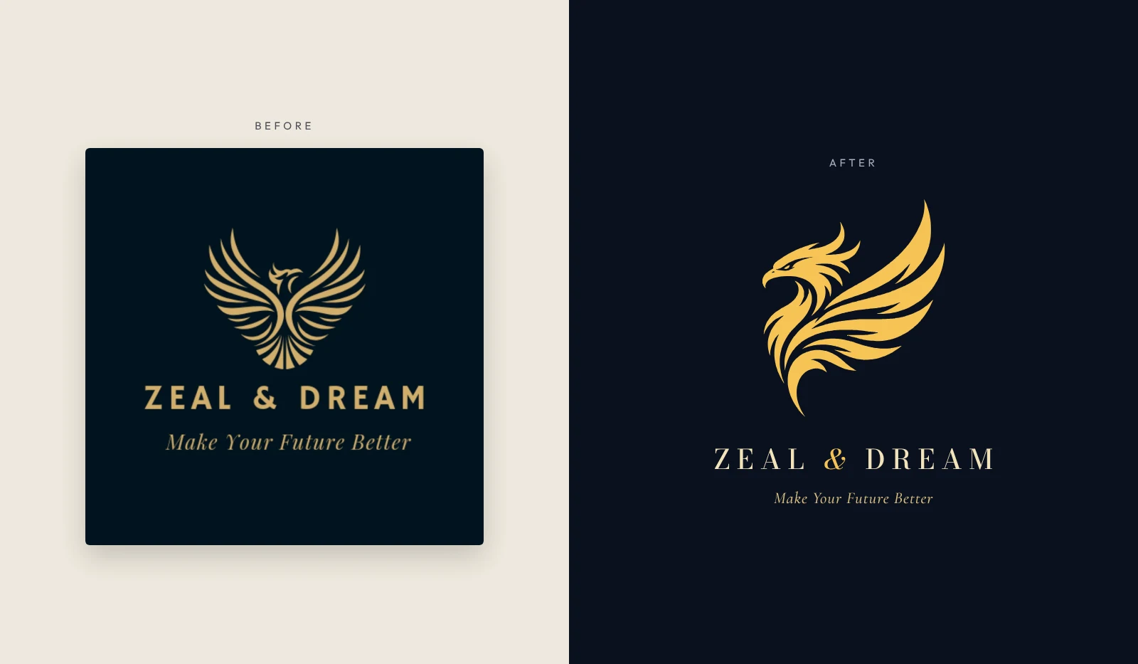
Zeal & Dream came to Makos Digital with a logo it already liked: a symmetrical gold phoenix with a heart-shaped spread of fine feathers on navy, the name in bold gold capitals and the tagline "Make Your Future Better" in italic beneath.
How we approached it
The brief was to keep the phoenix but make the logo more elegant and modern, and to make it work across every colour contrast — on dark and light backgrounds, in one colour and on brand colours.
The mark went through several rounds of client feedback. The direction that won was a phoenix that felt majestic and powerful rather than delicate, drawn in a flat style with sharp, confident shapes.
Client finalised
A flat phoenix in mid-ascent
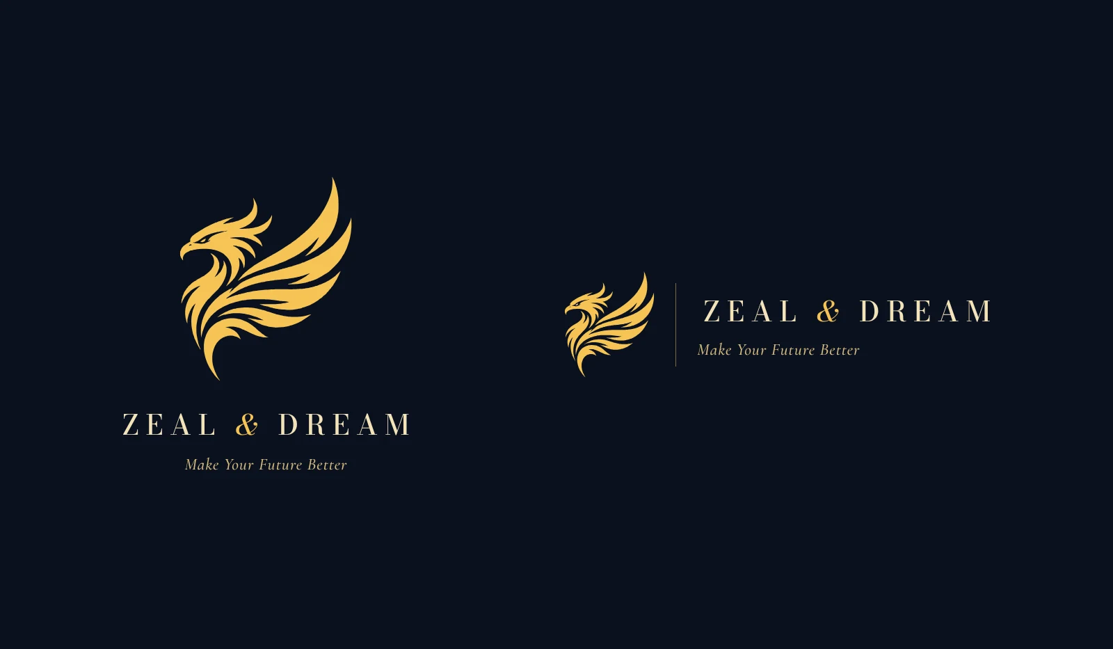
The new phoenix is drawn in side profile: a hooked beak and a swept-back crest of flame-like plumes, one great wing raised in long sweeping feather strokes, and a tail that curls underneath. Where the original spread its feathers evenly like a fan, the new mark moves up and forward.
It is a single flat colour — Phoenix Gold (#F5C354) on Midnight (#0A1120) as the primary pairing — so it reproduces cleanly in print, on screens and in one colour. "ZEAL & DREAM" is set in Bodoni Moda capitals with a gold italic ampersand, and the tagline stays, now in Cormorant Garamond Italic.
What the identity consists of
- Symbol: a flat phoenix in side profile — hooked beak, flame crest, one wing swept upward, tail curling beneath
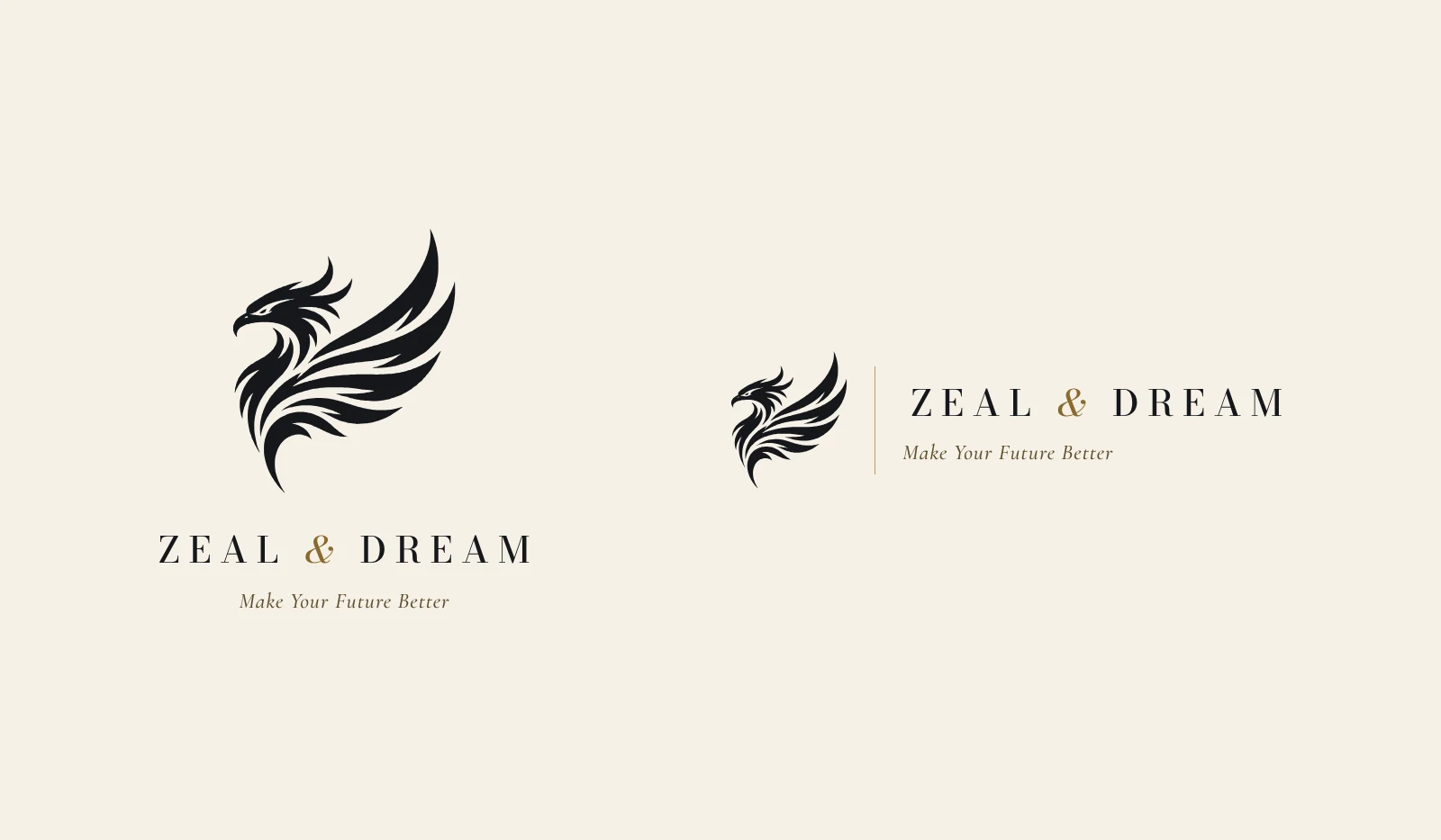
- Colour: Phoenix Gold #F5C354 on Midnight #0A1120, with Ivory, Ink and Antique Gold as secondary colours
- Wordmark: ZEAL & DREAM in Bodoni Moda capitals with a gold italic ampersand; tagline in Cormorant Garamond Italic
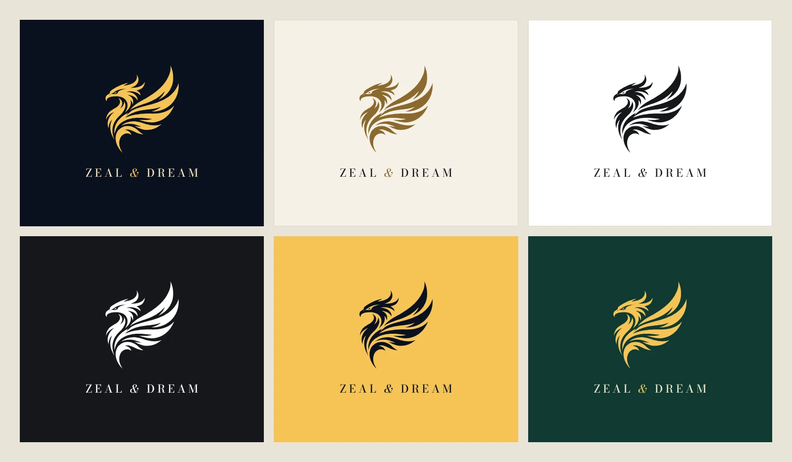
- Colour versions: full colour, gold on ivory, mono black, mono white, midnight on gold and gold on emerald
- Brand manual: 14 pages covering logo use, clear space, misuse, palette, typography, stationery and digital
Applications
The identity in use
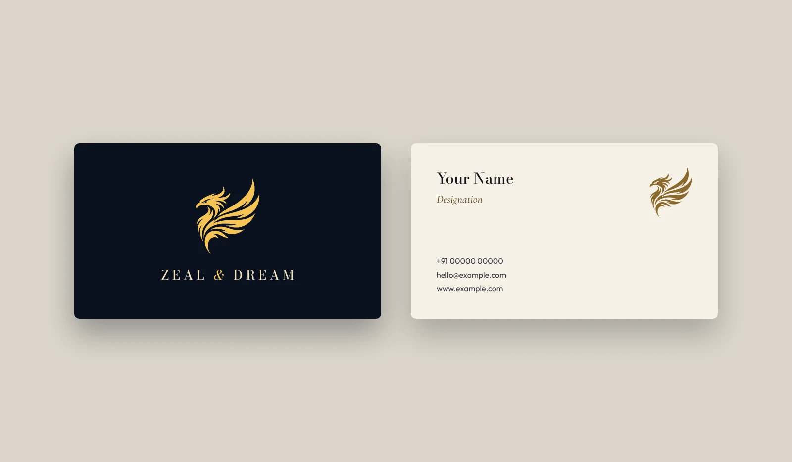
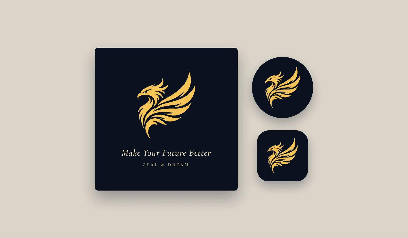
The phoenix across its colour versions, on business cards, and as a social post, profile picture and app icon. These are mockups from the brand manual, not photographs of finished production runs.
FAQ
Makos Digital redesigned it, starting from the phoenix logo the company already had. This page shows the original and the identity the client finalised.
The symmetrical, finely feathered phoenix became a flat phoenix in side profile with one wing swept upward, and the bold capitals became a refined Bodoni wordmark with an italic gold ampersand. The tagline, Make Your Future Better, stayed.
Phoenix Gold (#F5C354) and Midnight (#0A1120) are the primary pair, supported by Ivory, Ink and Antique Gold, with Emerald, Aubergine, Rose Gold, Sapphire and Platinum as accents.
Yes. Makos Digital prepared a 14-page brand manual covering the logo, clear space and minimum sizes, variations, colour versions, misuse, the colour palette, typography, stationery and digital use.
Yes. Logo and brand identity design is part of our Branding & Creative Design service — contact us with a short description of your business and we'll tell you how a logo project would run.
Need a logo or brand identity?
Tell us about your business and we'll show you how a logo project would run — real concepts, not templates.